We focused intensely on designing a strong, differentiated symbol that could compete at the top of the renewable energy market.
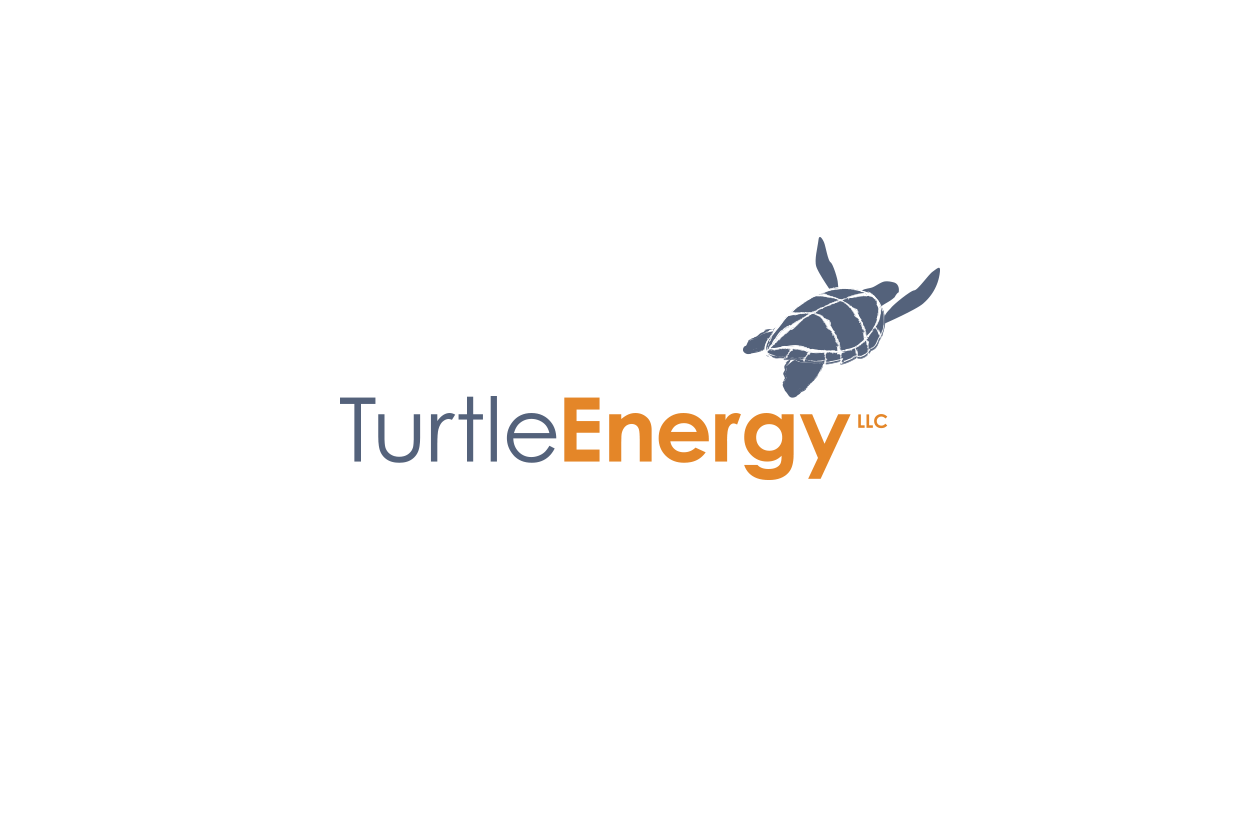
Turtle Energy Brand Signature
To leverage the equity of the previous logo, TE asked us to rework the turtle, and elevate the final design to signal TE’s market leadership and credibility.
To meet this goal we did extensive sketching in search of a turtle capable of expressing a timeless and iconic look. Working collaboratively with illustrator Zaara Windeisen, a specific angle & orientation provided the winning look and feel that also remained simple and clear.
Branded Marketing Material
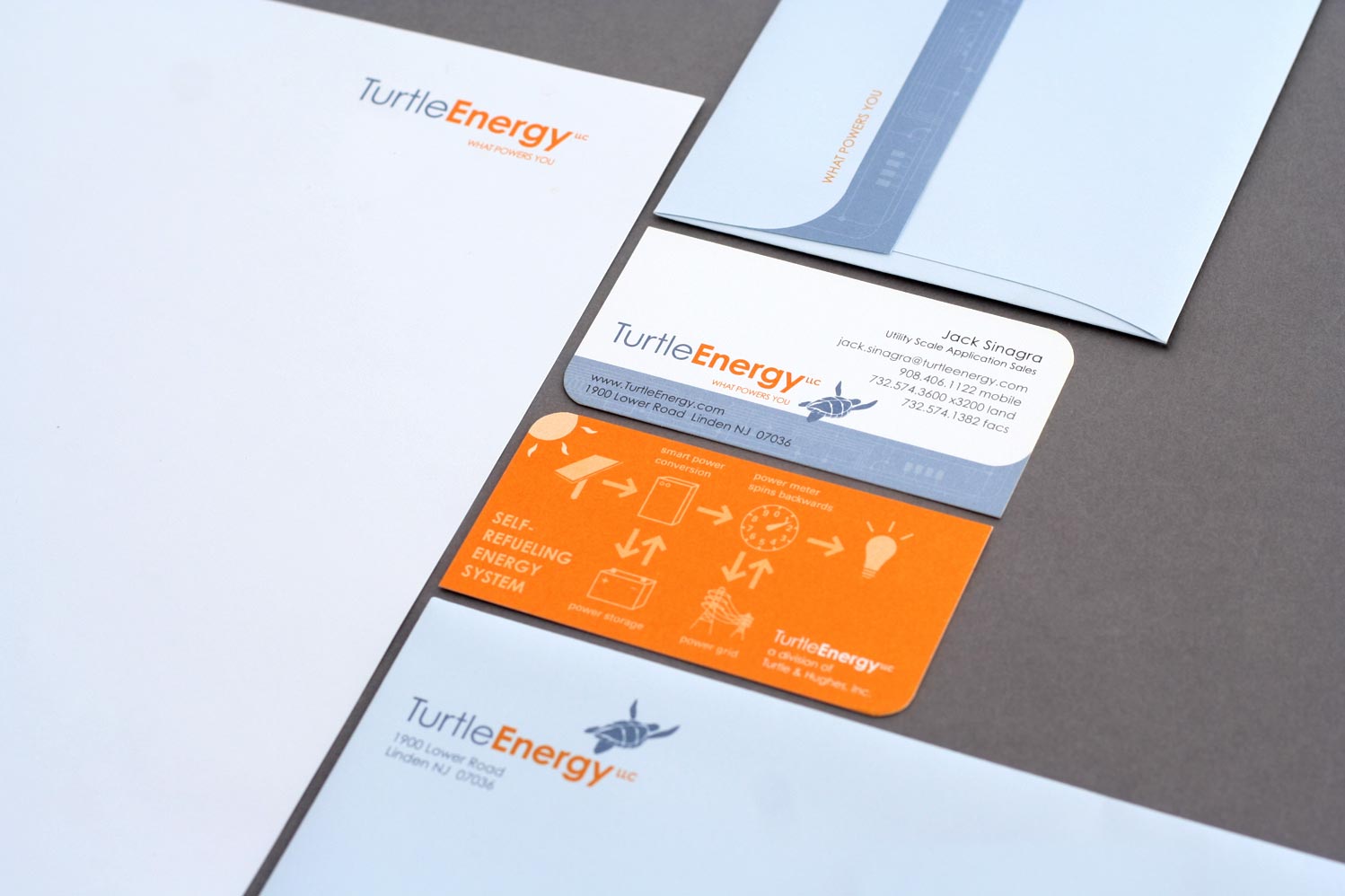
Continuity Is Its Own Signal
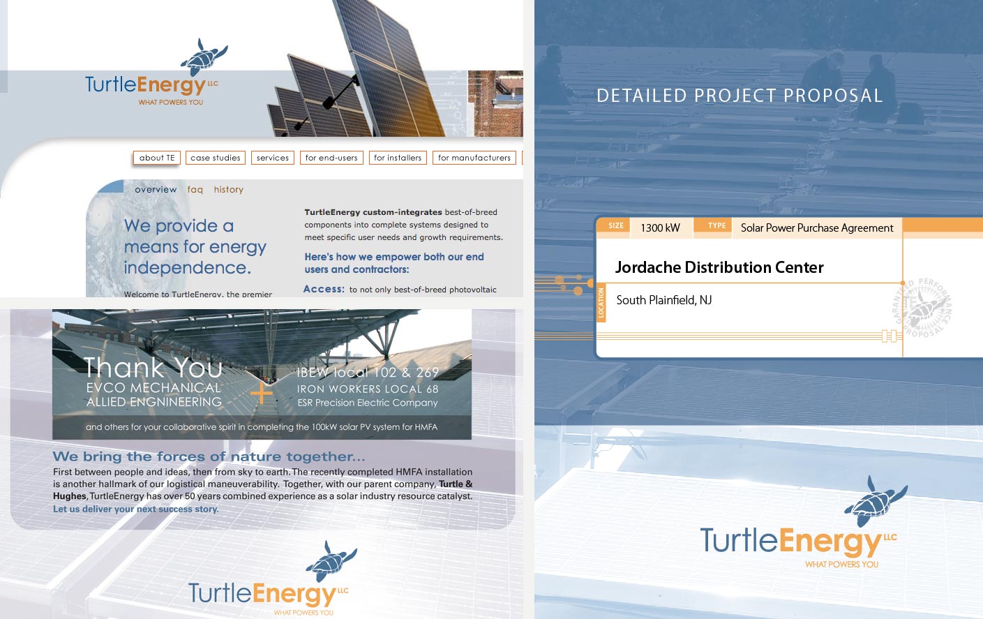
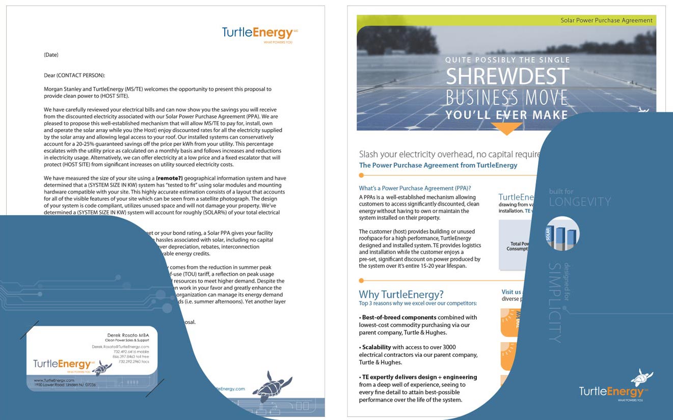
Strong continuity between all forms of media says ‘expect attention to detail from us’, and demonstrates a regard for customer time and attention.
Plaid Tractor directed and delivered tailored website design, copy writing, single page advertising, and proposal template design for competitive project bidding.
Modular Leave-Behind Marketing Material
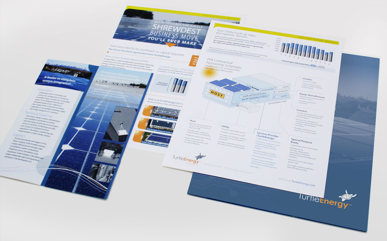
A customizable system allows new business dev teams to tailor promotions to best respond to customers with specific needs.
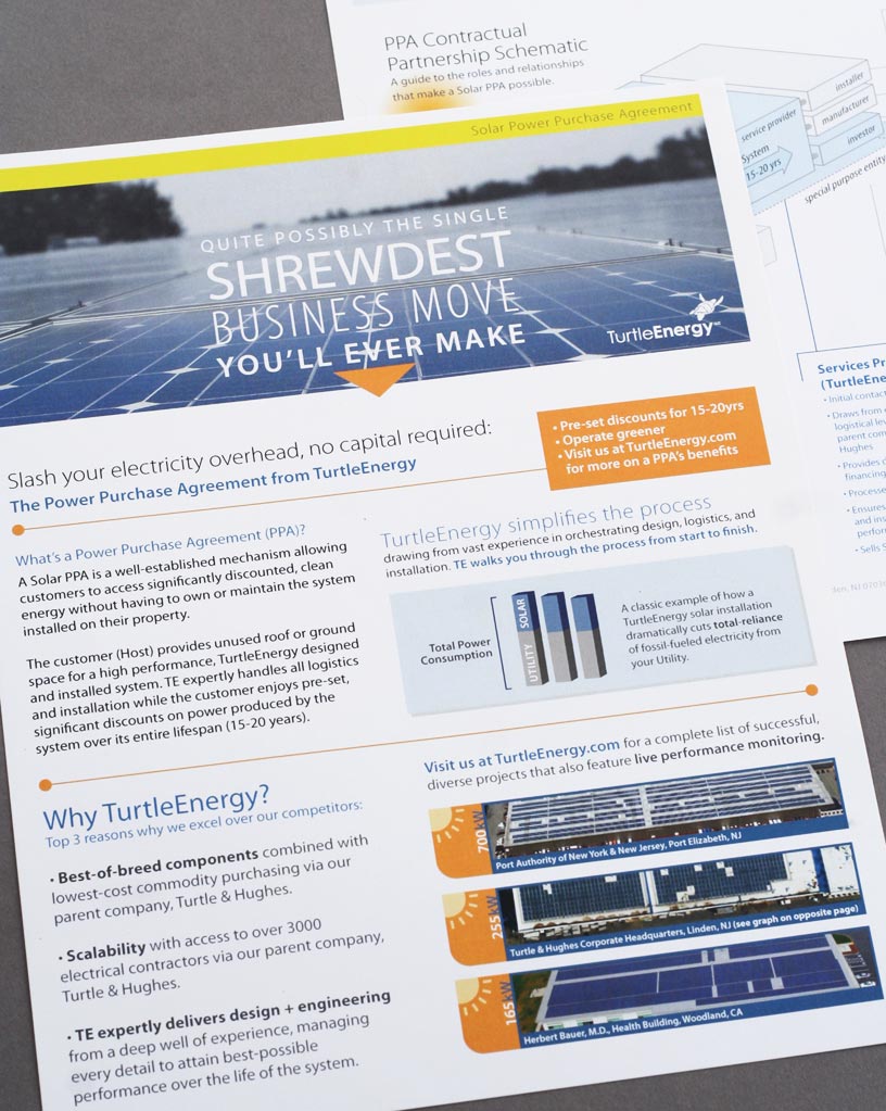
Detailed Promo/Explainer Sheets
Going beyond outlining benefits, trust and credibility was earned by “talking up to” customers by breaking down complex systems and relationships.
Which Design Principles?
Among several applied universal design principles, we kept only necessary elements in the final logo (Ockham’s Razor1), and applied classic Consistency to unite elements of the Turtle Energy visual system.
For the marketing material we used Chunking1, a technique that breaks down information into digestible segments, which allowed a reader to more quickly understand and retain the scope and relevance of a (solar energy) Power Purchase Agreement.
1Lidwell, W., Holden, K., & Butler, J. (2003). Universal Principles of Design: 100 Ways to Enhance Usability, Influence Perception, Increase Appeal, Make Better Design Decisions, and Teach through Design. Rockport Publishers.

