We achieved an authentic expression capable of representing a rich legacy and simultaneously symbolized T&H’s eye on the future.
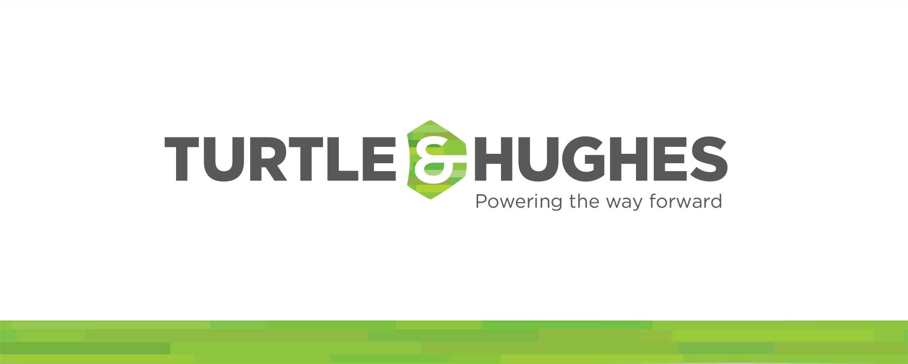
Our primary goals included boldly differentiating from competitors, reflect a rich legacy, and signal a complete command of the Electrical Equipment & Automation space.
T&H tapped our expertise (over a competing NYC design firm) to develop a brand identity to modulate to new technologies and platforms, convey 90+ years of credibility, and symbolize their enduring commitment to their customer’s progress and success.
Discovery
We approached this from several angles, including interviews to understand the culture. What drives C-Suite members, managers, and veteran employees? What do T&H customers value? A competitor audit was also conducted, organized to illuminate core strengths and market position, and later used to inform design and strategy.
Analysis
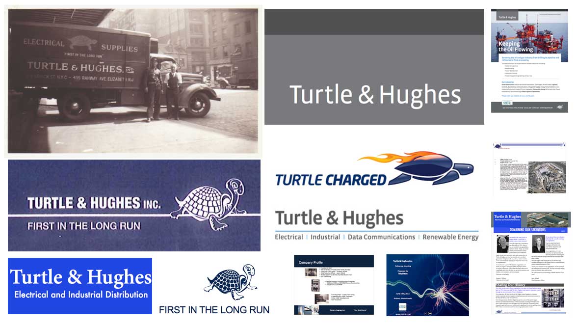
Special attention was paid to what media channels T&H used to reach customers, drive perceptions, and reflect its strengths wherever customers see and engage with its brand. A complete picture emerged of how T&H marketing and communications tools were used over time.
diagnosis
T&H was missing chances to make their value, stature, and uniqueness visible. Opportunities were identified for T&H to visually signal its consistent dedication to quality, its commitment to innovation, and outwardly reaffirm its reliability to its customers.
strategy
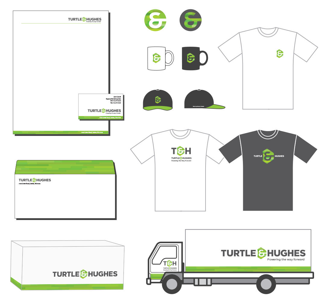
Our core recommendation was to consistently and boldly signal differentiation to set T&H apart. To show its dependable quality, order a dependably visible execution of a new, reflective brand presence and its supporting visual assets. The core identity is used as a customer facing reference point, a tangible sales asset, and capable of representing endurance, stature, performance, and innovation. Room would be left in the design for the brand to grow and evolve with it.
“Robert’s persistence and creativity got us to the finish line on the very complex task of rebranding a 90-year-old company with a very diverse business structure. I applaud his attention to detail, strategic thought process and expertise, which all contributed greatly to our success.”
– Jayne Millard, CEO, Turtle & Hughes, Inc.
Competitor logos representing the top layer of the competitive audit, revealing opportunities for T&H to affirm leadership & stand apart:

matching tone to strategy
The overall design objective was to simultaneously show their established legacy while affirming a progressive, leading position in their industry.
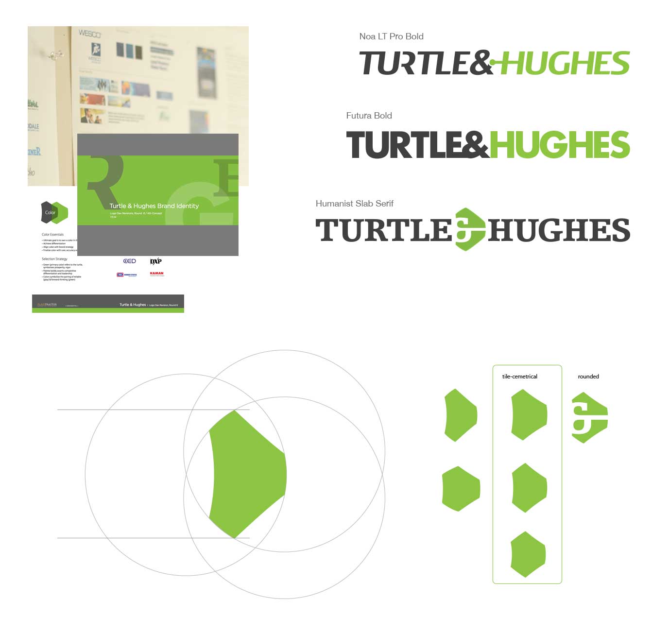
Below: A wordmark approach best accommodated name recognition, and provided an opportunity to express tone and character through typography.
All three of the first round design concepts were lauded by the CEO Jayne Millard and her team for so effectively representing the findings and objectives of the internal audit.
The final concept
A single section of a turtle’s shell (also known as a ‘skute’) was further refined to symbolize and reinforce the name, and provide a visual shorthand for other applications. More deliberate emphasis of the ampersand in this way provides an opportunity to (literally) reference to T&H’s diversified expertise across business categories.
The final typographic tone is designed to confidently embody stature, stability, strength, and dependability. Soft, humanist lines and curves helps it feel both firm and friendly. A modern, progressive feel overall signifies a commitment to innovation.

Which Design Principles?
Among several universal design principles, we leveraged Ockham’s Razor1, in which only the simplest, clearest visual choices were made to convey meaning. When the least essential elements in a design can be eliminated, the power and effectiveness of the remaining visual choices are strengthened.
1Lidwell, W., Holden, K., & Butler, J. (2003). Universal Principles of Design: 100 Ways to Enhance Usability, Influence Perception, Increase Appeal, Make Better Design Decisions, and Teach through Design. Rockport Publishers.
